Long before the official Return of Royalty, there was a decision made to do things differently this time around. The Utah Royals’ new brand identity began as an idea which sprouted during a meeting at Royals Co-Owner Ryan Smith’s house in Provo last May.
Smith, Real Salt Lake President John Kimball, Utah Royals President Michelle Hyncik, and RSL Vice President of Marketing & Game Production Tyler Gibbons were deliberating with Nike on the design of future Royals kits when the discussion took a turn to the previous Royals logo.
With new ownership and leadership at the helm of Utah’s beloved professional women’s soccer Club, the idea of trying something different from a brand perspective began to come to fruition. Following that meeting in Provo, other sections of the ownership group began to chime in with their ideas and then the ball really started to get moving for the new Royals brand.
The goal for the new iteration of the Royals was clear, creating a Club that was made by women, for women. The new Royals brand had to match that same ethos, while also giving Utahans’ a professional women’s soccer club they could be proud of again.
“The goal ultimately is you want to build a Club that people want to associate with win, lose, or draw because it represents Utah, it's community, and the people who call the state home,” Gibbons said.
“We're building a women's football club run by women that empowers women. We want that to be kind of the long lasting embodiment of what people think of when they hear the words Utah Royals. That's what we hope people will feel. No matter what, because nobody wins forever, but outside of what’s going on on the field there's still a foundation of what the badge itself represents to a greater community and hopefully that becomes a symbol that people resonate with.”
Creating that symbol was the group’s next challenge.
After going through multiple designers, the Club finally landed on Tovah Kaiser, and her Philadelphia based studio Tov Creative, to take the Royals into its next era. Kaiser and her women-run studio worked tirelessly to create a symbol that pleased all parties and represented everything they wished the Royals to stand for.
“With Tovah and her team, we finally found the right mixture of all the different elements that we were looking for,” Gibbons said.
The group went through more than 20 different crests before finally landing on the new Royals crest you see today. The lengthy process which involved so many people finally reached its end point, just in time for the brand launch on March 11 at the Real Salt Lake season opener. On the Friday before the match, RSL hosted a women’s empowerment luncheon at America First Field which Kaiser attended and where her logo was first made public. The Return of Royalty was finally becoming real in Utah.
“It was such a cool opportunity to work with the Royals,” said Kaiser.
“Being a female-focused and primarily female design team and then also being a former soccer player myself, it was just an amazing marriage of everything that I care about”.
When designing the new Royals brand, Kaiser and her team took inspiration from the recently well received logos of fellow NWSL Club’s NJ/NY Gotham FC and Angel City FC, with their ownable crest shapes and contrasting colors.
From there they created three main drivers for the new design that guided their creative process.
“The mantra of the Return of Royalty, wanting to represent Utah, and then empowering women were our three north stars when designing this new brand,” said Kaiser
Kaiser and her team took the slogan of the Return of Royalty to heart. They understood that this wasn’t just a new team, this was a team that was coming back to a state that dearly missed its Club. Their goal was to take elements and inspiration from the previous logo, but modernize it to fit the new era the Royals are about to step into.
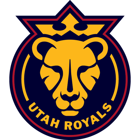
Secondly, they wanted Utanans to see their state in the new brand which shines through with the iconic Utah mountain ranges appearing in the crown as well as the secondary logo being in the shape of the state.
Finally, they wanted to create a brand that would help women feel empowered.
“To start, we've got this really fierce, expressive lioness wearing the crown,” Kaiser said.
“It’s super bold. We wanted to create a brand that felt really powerful and made women feel powerful. Something that we think young women would be excited to wear and feel inspired by.”
As the new branding was finally revealed to the general public on March 11, the new iteration of the Utah Royals, a Club made for women, by women, finally had a logo to encapsulate what they wanted to represent. All created by a woman owned design studio. An idea that started in Provo, was built in Philadelphia and born in Sandy, Utah for the state of Utah. The Return of Royalty is finally here.


